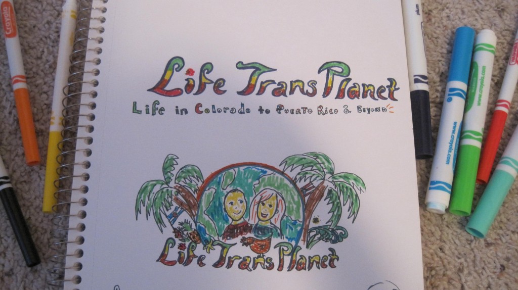
Yesterday after work I had the pull to do something artistic/creative. I’ve always loved drawing and especially drawing with markers. While marker art it is not considered a fine or high art, it is a lot of fun for me and lets me express my creative visions. I pulled out a sketch pad and started working. This was my first concept:
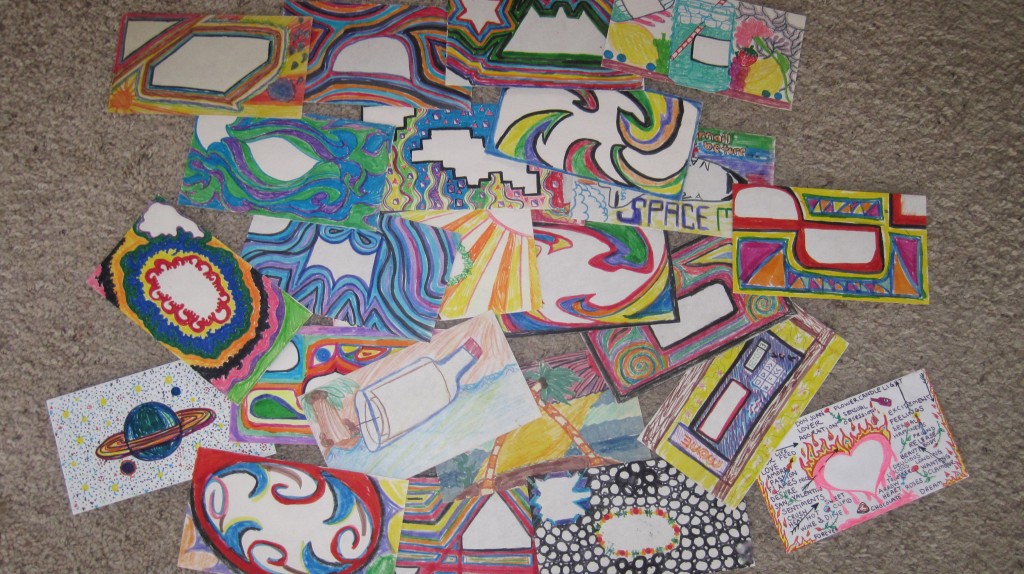
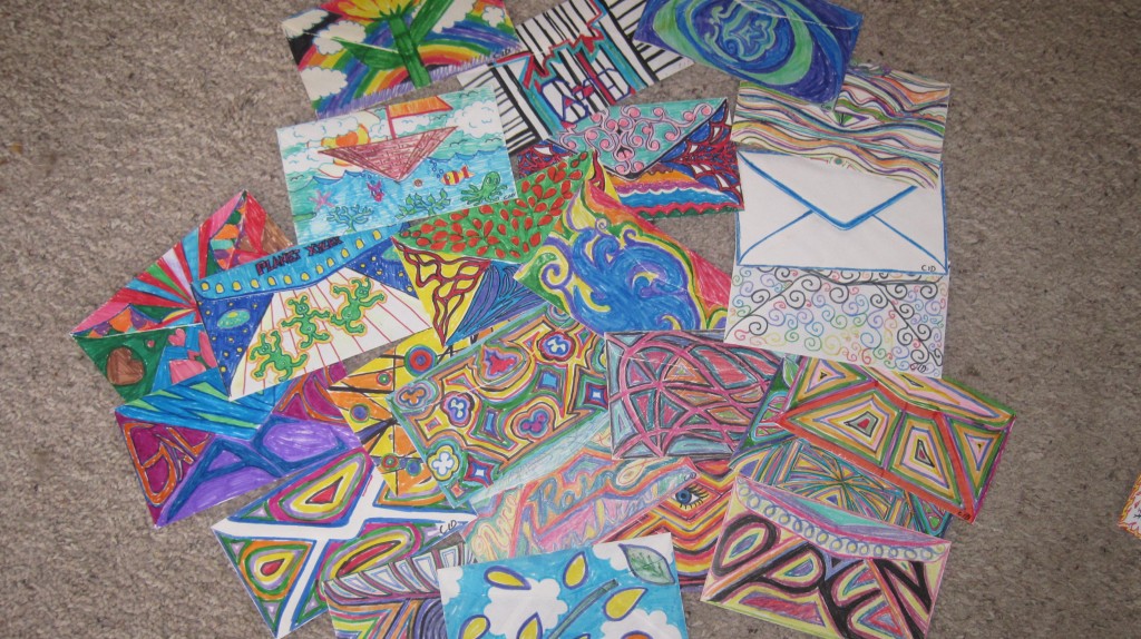
When I was an early teen I found some old love-letters that my mom had kept from an old high school boyfriend of hers. The envelopes and letters were highly artistic and I found myself wanting to try it out for myself. So I did. And over the years I have created probably about 50 different envelopes front and back sides hand drawn in either colored pencil or (mostly) marker. Some of them I sent to friends with a letter, but most I have kept.

Some of my designs (front side) (click to enlarge for details)
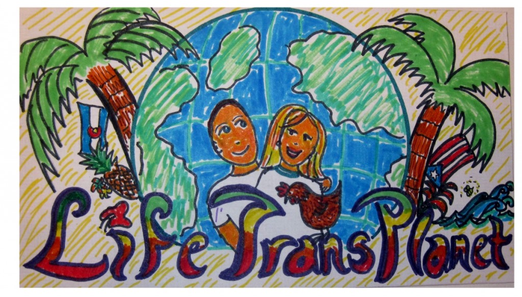
So I thought it would be fun to put my sketch concept onto an envelope and fine-tune some of my original sketch-pad drawing. Here’s how the envelope turned out (a photograph):
The feeling I was going for was a warm tropical vibe. Similar to our current banner on this site, I wanted us, a chicken, a bee, the sea, some flowers, fruit and palm trees. I also wanted to show the Colorado and Puerto Rico connection through using the flags. Puerto Rico’s official flower is the red hibiscus so I used that as the dot of the “i” on Life. The Planet backdrop tied the whole concept of “Transplanet”.
I would like to make this image a little crisper to use as a logo and header for this website. When photographing paper, it’s sometimes difficult to get the exact colors. I was also toying with the idea of cartoon-izing a photo of Britton and my faces instead of the actual cartoon.
What do you think? Do you like it? Any feedback? Should I have a professional graphic artist have their hand at it or does it have a special sentiment/cool factor in its very amateurishness as Britton says? Overall, it was fun and I think we have a good general concept with which to work.


I LOVE IT! use it on your blog!
I love it too. I think my cartoon rendering is mui guapo.
Cassie
It’s adorable. This blog reminds me of a diary of your lives and diaries are full of drawings. Love it!
Laura
It’s great but you need to include Kitty.
I really like how you matched, either on purpose or by accident, the colors of the title to the colors of the flag and coat of arms of Rincón.
Thanks everyone. Jeff, I was just thinking about where to put Kitty. 🙂 Adolfojp, I didn’t really even think about Rincon’s coat of arms. It must be meant to be!